
How to curve text
Free in your browser, nothing to install: try this in BoboCreate Online.
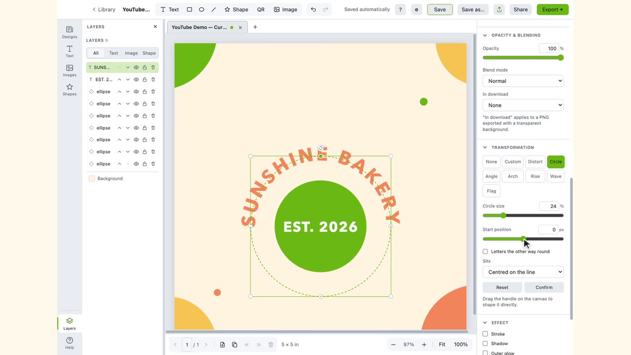
Select the text, find Transformation in the panel on the right, and pick a shape. Arch bends the line, Circle sets it around a ring, Wave runs it along a wave, and Custom follows a line you draw. Each shape has its own sliders. Confirm keeps the result, and Reset takes the text back to a straight line.

The steps
-
Select the text
Click it on the page. The shapes work on a text box. Words that are part of a picture cannot be bent.
-
Open Transformation
It is in the panel on the right, below Opacity & blending. Its buttons are the shapes. None is straight text.
-
Pick a shape
The text bends straight away, where it was, and the shape's settings appear under the buttons.
-
Adjust it
Drag a slider, or type a number in the box beside it.
-
Click Confirm
The settings lock, so a stray drag cannot change the shape. To change it later, select the text and click Edit.
Which shape does what
| Arch | Bends the line into an arch. Arch amount 1–100%, Letter spacing 0–20, Upside down. |
|---|---|
| Circle | Sets the text around a circle. Circle size 1–100%, Start position −300 to 300 px, Letters the other way round, Sits. |
| Wave | Runs the text along a wave. Wave height −100 to 100%, Length 0–100%, plus the same Start position, Letters the other way round and Sits. |
| Custom | Follows a line you draw by dragging its start, middle and end on the page. Start position, Letters the other way round, Sits. |
| Rise | Letters growing from small to large. Rise amount 1–100%, Letter spacing, Upside down. |
| Flag | Large letters falling away to small. Flag amount 1–100%, Letter spacing, Upside down. |
| Angle | Letters turned along a shallow arc. Angle amount 1–100%, Letter spacing, Upside down. |
| Distort | Leans the text away into perspective. Lean away −100 to 100%, Slant −60° to 60°, Letter spacing. |
Arch: a curve for a heading
Arch amount is how deep the curve is: more is deeper. Around 40% is a gentle curve for a heading, as in the picture above. Upside down turns the arch over so the line curves downward, which suits words under a picture. Letter spacing opens the letters up when a deep curve crowds them.
Circle: words around a badge or logo

Circle size is the ring's radius as a share of the page's width. On a page 5 in wide, 20% puts the letters 1 in from the centre, so the ring is 2 in across. The same percentage is a bigger ring on a wider page.
The ring is drawn around the middle of the text box. Drag the text onto whatever it should go around; the dashed circle is the line the letters sit on. Start position slides the words around the ring. At 0 they are centred on top.
Sits sets where the letters are against that line: Centred on the line, On the line, Hanging below, or Above the line.
Words along the bottom, the right way up
Use a second text box for them. Pick Circle with the same Circle size, tick Letters the other way round, then click Rotate 90° right twice, under Rotate and flip. The words now run along the bottom of the ring, left to right. Drag the box onto the same centre as the top line.
Wave

Wave height is how far the line rises and falls. A negative height starts the wave downward instead of up. Length stretches the wave out past the width of the words.
Custom: a line you draw

Custom starts as a straight line the width of the text, with three points on it: the start, the middle and the end. Drag any of them on the page and the letters follow. Dragging the middle up gives an arch exactly as high as you want; dragging one end down makes the line slope.
Rise, Flag, Angle and Distort
- Rise grows the letters from small to large, up to the text's own size. Rise amount sets how small the first ones start, down to a fifth of it.
- Flag is the opposite: large letters first, falling away to small.
- Angle turns the letters along a shallow arc.
- Distort makes one end of the line smaller, so it seems to lean away. A negative Lean away picks the other end. Slant tips each letter, up to 60° either way.
Back to straight
Reset takes the text back to a straight line, in the same place and on one line. The font, size, colour, outline and effects stay as they were.
Where it goes wrong
- The ring runs off the page. Circle size is a share of the page width, so a wide page makes a wide ring. Lower Circle size.
- The words along the bottom read upside down. Tick Letters the other way round, then rotate that text box 180°.
- The sliders are greyed out. The shape has been confirmed. Click Edit.
- The letters crowd on a deep arch. Raise Letter spacing, or lower Arch amount.
Try it free in your browser
Every step in this guide works in BoboCreate Online: the Transformation panel is the same.
BoboCreate Online is free, with no account. Its downloads carry a small “Made with BoboCreate” mark; the BoboCreate app exports without it, and adds photos, video, cutting files and print quality.